 Oprezo India
Get a Free Quote
Oprezo India
Get a Free Quote
Oprezo India
Get a Free Quote
Oprezo India
Get a Free Quote
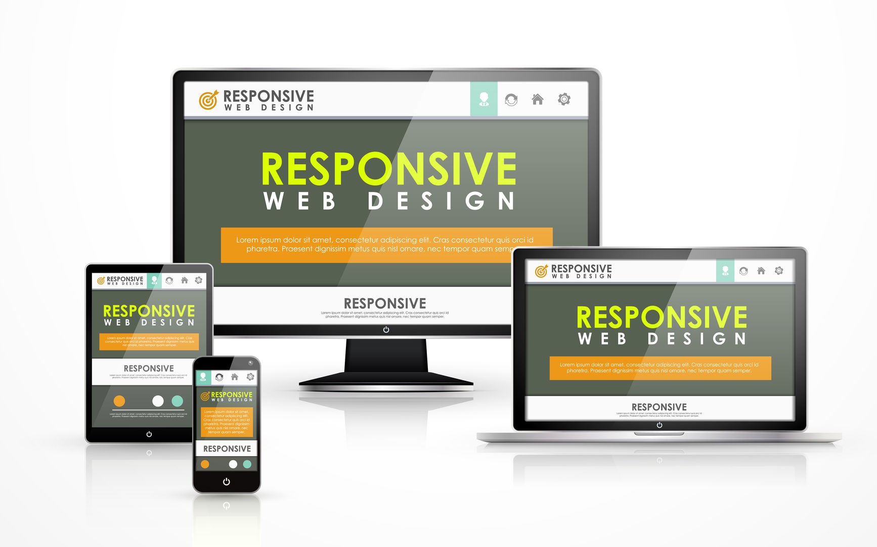
Looking for a reliable responsive web design company in Delhi NCR? Oprezo India builds websites that adapt smoothly across phones, tablets, and desktops, for startups, SMEs, and enterprises across Delhi, South Delhi, Gurugram, and Noida. With mobile traffic making up the majority of website visits for most businesses, a design that only works well on desktop is no longer just a usability gap — it's a direct hit to conversions and search rankings.
Whether you need a new site built responsive from the ground up or an existing site retrofitted with a proper mobile-first layout, our team combines flexible grid systems, optimised images, and real-device testing to make sure your site performs everywhere your customers actually are.
We design for the smallest screen first, then progressively enhance for tablets and desktops — the approach that produces the most reliable results.
Flexible, percentage-based layouts and CSS breakpoints tailored to how your actual content behaves, not generic device presets.
Compressed, responsive images and lazy loading keep pages fast on mobile connections, where load time matters most.
Google has used mobile-first indexing for years now, meaning it primarily evaluates the mobile version of your site when determining search rankings — not the desktop version. A site that looks fine on a laptop but breaks or scrolls awkwardly on a phone is actively working against your SEO, regardless of how good the content is.
Beyond rankings, the business case is straightforward: visitors who struggle to navigate a site on their phone bounce quickly, and that lost traffic rarely comes back. Responsive design isn't a cosmetic upgrade — it's core infrastructure for how most businesses acquire and convert customers online today.
Layouts built on percentage-based widths rather than fixed pixels, so content resizes naturally across screen sizes.
Breakpoints defined around how your content actually breaks, not arbitrary device-width assumptions.
Images served at the right resolution and format for each device, cutting load time without sacrificing quality.
Buttons, forms, and navigation sized and spaced for finger input, not just mouse precision.
Core content and functionality work everywhere; richer interactions layer on for capable devices and connections.
Testing across actual Android and iOS devices, not just browser emulators, to catch what simulators miss.
1. Content & Layout Audit — We review your content structure to identify what needs to adapt across screen sizes.
2. Mobile-First Wireframes — Design starts at the smallest breakpoint and scales up from there.
3. Development with Fluid Grids — Flexible layouts and media queries built to your actual content, not presets.
4. Image & Asset Optimisation — Compression, responsive formats, and lazy loading applied throughout.
5. Cross-Device Testing — Real devices and browsers checked before launch, not just emulators.
6. Ongoing Monitoring — Performance and layout checks as new devices and content are added.
Our Delhi NCR-based design and development team builds responsive sites using CSS Grid and Flexbox for flexible layouts, modern image formats (WebP/AVIF) with responsive `srcset` attributes for optimised delivery, and lazy loading for below-the-fold content and images.
For performance, we use Google Lighthouse and PageSpeed Insights to benchmark and improve Core Web Vitals, and implement progressive web app (PWA) features like offline caching where it adds genuine value. All responsive builds are tested against real device labs covering common Android and iOS screen sizes before launch.
Not every non-responsive website needs a full rebuild. If your current site is built on a reasonably modern framework or CMS theme, we can often retrofit responsive layouts — restructuring CSS, adding breakpoints, and optimising images — without touching your content or backend. This is usually faster and cheaper than starting over.
Older sites built on fixed-width tables, outdated CMS themes, or heavily customised legacy code usually don't retrofit cleanly — the underlying structure fights against flexible layouts at every turn. In those cases, a rebuild on a modern, responsive-first foundation is the more reliable path, even though it's a bigger initial investment. We assess your specific codebase before recommending either route.
Many "responsive" sites we audit still have real problems: images that load at full desktop resolution even on mobile, touch targets too small or too close together for reliable tapping, text that requires pinch-zooming to read, and layouts that technically resize but break visually at certain widths because breakpoints were copied from a template rather than built around the actual content.
These issues often don't show up in a quick desktop-browser check, which is exactly why real-device testing matters — a site can look "responsive enough" in a resized browser window while still frustrating real mobile users.
Google's Core Web Vitals — Largest Contentful Paint, Interaction to Next Paint, and Cumulative Layout Shift — are directly affected by responsive design decisions. Images that aren't properly sized for their container cause layout shift as they load. Unoptimised assets slow down the largest contentful paint, especially on mobile connections. Poorly implemented breakpoints can even cause content to jump or reflow visibly as the page renders.
We treat Core Web Vitals as a design constraint from the start rather than a metric to fix retroactively — sizing image containers correctly, prioritising above-the-fold content loading, and avoiding layout patterns that shift once fonts or ads load in.
When comparing responsive web design companies in Delhi NCR, ask to see their previous work on an actual phone, not just a resized browser window — many issues only surface on real touch devices. Ask how they approach breakpoints: a team that uses only the standard Bootstrap-style breakpoints regardless of your content is taking a shortcut that often produces awkward mid-range results.
It's also worth asking whether Core Web Vitals and page speed are part of their standard delivery process or an optional add-on, since a responsive site that loads slowly on mobile networks still fails the actual goal of reaching mobile users effectively.
As a responsive web design company headquartered in Delhi NCR, Oprezo India works with startups and enterprises across Delhi, South Delhi, Gurugram, Noida, and Faridabad, as well as remote clients across India, the US, UK, and UAE. With mobile traffic continuing to grow through 2026, responsive design remains one of the highest-leverage investments a business can make in its online presence.
Costs typically range from ₹20,000 for a small business site to ₹5+ lakhs for a large, feature-rich responsive platform. We provide a free scope-based quote.
They're related but not identical — responsive design uses flexible grids and media queries so one codebase adapts across all screen sizes, which is the most reliable way to achieve mobile-friendliness.
Yes — Google uses mobile-first indexing, so a poor mobile experience directly hurts your search visibility.
A standard business site takes 3-5 weeks; a larger site with custom layouts can take 6-10 weeks.
Often yes, if it's built on a flexible framework. Older fixed-width or table-based sites usually need a rebuild for a reliable result.
Yes — we design and test across phones, tablets, laptops, and desktops using breakpoints tailored to your content.
Yes, alongside dev tools we test on real Android and iOS devices to catch issues simulators sometimes miss.